We Analyzed 15 SaaS Blogs to See How Top Teams Handle Hero Images

Most SaaS blogs look the same. Generic stock photos. Inconsistent styles. Random illustrations that don’t connect to the content.
But some teams get it right. Their blogs feel polished and on-brand, every single post. The hero images do actual work—they grab attention, reinforce the topic, and make the content more shareable.
We pulled examples from 15 SaaS blogs that consistently nail their hero images. For each one, we’ll show you what they’re doing and why it works.
Notion



Notion uses soft, muted colors and clean compositions. Their images feel calm and organized—which matches their product perfectly. Notice how they use illustration and photography together without it feeling cluttered. The consistent warm color palette ties everything together even when the subjects vary.
Linear



Linear’s blog mirrors their product: minimal, dark, and precise. They use gradients and abstract shapes that feel technical without being cold. The dark backgrounds make the content pop and give the whole blog a premium feel. This is a good example of letting your product aesthetic drive your content design.
Webflow



Webflow mixes photography, illustration, and UI mockups. What ties it together is their bold color choices and consistent typography treatment. They’re not afraid of bright colors and high contrast. Their images feel creative and energetic—fitting for a design tool company.
Framer


Framer goes heavy on 3D renders and motion-inspired graphics. Their images feel dynamic and modern. The dark backgrounds with vibrant accent colors create strong visual hierarchy. This works because Framer is a design tool—their blog images demonstrate the kind of work you can create with their product.
PostHog



PostHog takes a completely different approach: hand-drawn illustrations with a quirky, irreverent style. Their hedgehog mascot appears throughout. This works because it matches their brand personality—developer-focused, transparent, and not taking themselves too seriously. Proof that polished doesn’t always mean corporate.
Pitch



Pitch uses clean, geometric illustrations with a limited color palette. Their images feel professional but approachable. The consistent illustration style means you can recognize a Pitch blog post instantly in a social feed. Good example of building visual brand recognition through content.
Mailchimp

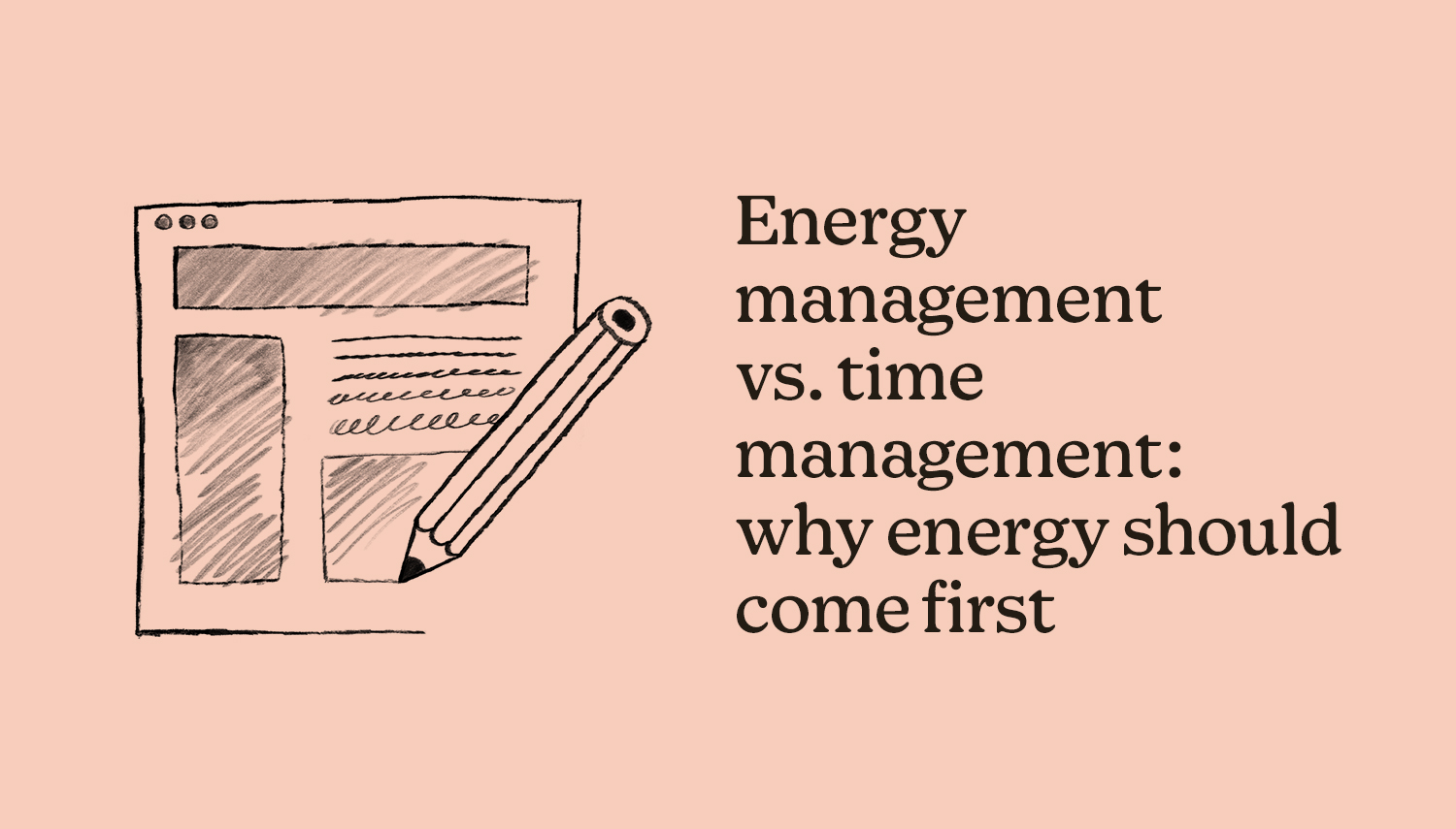

Mailchimp’s blog imagery is bold and playful. They use bright yellow backgrounds, custom photography, and their signature illustration style. The images feel warm and human—important for an email marketing tool that helps small businesses connect with customers. Notice how the photography style stays consistent even with different subjects.
Semrush


Semrush publishes a lot of content, so their hero images need to scale. They use a consistent illustration style with their brand orange. The images are topical—you can tell what the article is about from the hero image alone. This is important for a blog that covers many different SEO and marketing topics.
Backlinko


Backlinko uses custom illustrations that directly relate to the content. Each image tells a mini-story about what you’ll learn. The green brand color appears consistently. This approach works well for educational content—the images set expectations for what the article will teach.
Think With Google



Google’s marketing blog uses bold, graphic illustrations with strong geometric shapes. The images feel authoritative and data-driven—fitting for a publication focused on marketing insights and research. The clean compositions work well at any size, from thumbnails to full-width headers.
Salesforce


Salesforce balances photography with illustration and graphic elements. Their blue brand color anchors everything. For an enterprise company with diverse content topics, having a flexible but recognizable visual system is key. The images feel professional without being boring.
UserSnap


UserSnap uses colorful, friendly illustrations with a consistent style. The images feel approachable and helpful—matching their product focus on feedback collection. Simple compositions that read well as thumbnails. Good example of illustration style that scales well for a growing content library.
Toptal



Toptal’s design blog uses abstract, artistic imagery. The images feel creative and sophisticated—appropriate for content aimed at senior designers and developers. Dark backgrounds with vibrant colors create visual interest. Each image feels unique while still fitting the overall brand.
Napkin AI
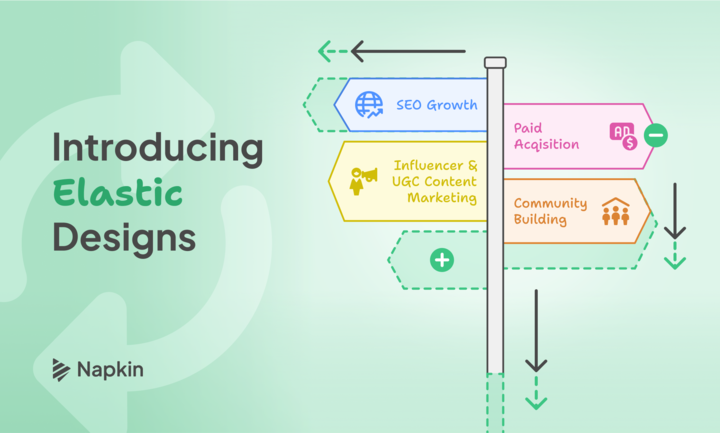
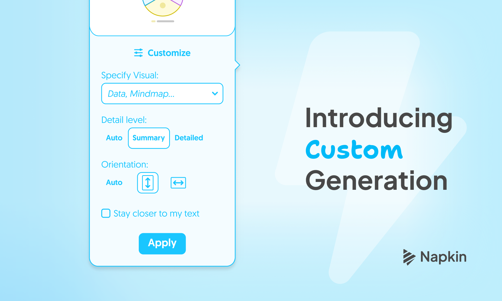
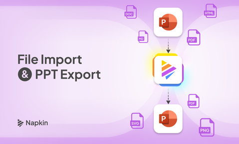
Napkin AI uses their own product to create blog images—smart move. The images showcase what the tool can do while serving as functional hero images. Clean, diagrammatic style that matches their product’s purpose of turning text into visuals. Dogfooding at its best.
ElevenLabs



ElevenLabs uses dark, moody imagery with audio waveforms and sound-related visuals. The images reinforce their focus on voice AI. Gradient backgrounds and abstract shapes create a futuristic feel. Good example of letting your product domain influence your visual language.
Key Takeaways
After looking at these 15 blogs, some patterns stand out:
Consistency beats variety. The best blogs have a recognizable visual style. You can spot a PostHog or Linear post in a feed instantly.
Match your brand personality. Playful products use playful imagery. Enterprise products stay professional. The hero images should feel like they came from the same company that built the product.
Topical images perform better. Images that relate to the article content get more clicks than generic decorative graphics.
Dark backgrounds are having a moment. Several top SaaS blogs use dark themes. It feels modern and makes colors pop.
Custom beats stock. None of these blogs rely on generic stock photos. They invest in custom illustration, photography, or branded graphics.
Creating Hero Images for Your Blog
Building a consistent hero image system takes time and resources. You need either a designer on staff or a reliable process for creating images at scale.
That’s exactly why we built imghero. Paste a URL, get a hero image that matches your content. No design skills required, no hunting for stock photos.
Stop wasting time on images
Your content deserves better visuals
Paste a URL. Get a stunning image. It's that simple.
Start Creating

